Build an AI website in 60 seconds

AI generates your personalized website instantly with built-in scheduling, payments, email marketing, and more.

Start for free
Built in tools to grow your business

Logo design principles that seamlessly match your brand
27 February, 2019 · 6 min read·Website design
Logo design principles that seamlessly match your brand
Your logo is a permanent feature of your brand’s identity. Our advice helps you nail the logo design process the first time.

When you’re about to launch a new website for your business, one of the easiest ways to create brand consistency is through your logo. Your website’s logo can also act as a favicon. Feature it throughout your social media channels, as part of your offline marketing materials, and inside your email newsletters.

Whether you’re just starting to brainstorm your logo or you think your existing logo could use a refresh, it helps to have some design tips. With our advice, you can design a stunning logo that you’re proud to use.


Decide what your brand is trying to achieve

You know your business better than anybody else, which means you’re the best person to understand what your brand is aiming for. Understanding your brand and its mission is crucial if you’re going to design a logo style that represents it.

  • As part of the process, think about the following:
  • What does your company want to do for its customers?
  • Who is your target audience?
  • Is there an ethos that underpins your brand? For example, fast, relaxing, luxury, budget

Try creating a mood board with images and phrases that you would feel comfortable using as a part of your branding. These images and phrases won’t form part of your logo but they will act as inspiration during the design process.


Consider the colors that represent you

Once you understand your brand, you can start looking at the colors that represent it. For example, blue is a good fit for health care as it conveys a sense of trust and instills calm, which is exactly what prospective patients want.

Choose the right color to represent your business

Other examples of how colors represent different industries include:

  • Red is an excellent choice when you’re trying to create a sense of urgency, like when you’re offering a discount or advertising limited quantities.
  • Green is excellent for natural health and nature-focused products.
  • Purple is often synonymous with luxury and creates a sense of exclusivity.
  • Orange and yellow are perfect for businesses that represent happy products, like vacation rentals or travel planning.
  • White is perfect when you want a minimalist feel or you want to convey a sense of serenity.

Make sure the fonts match!

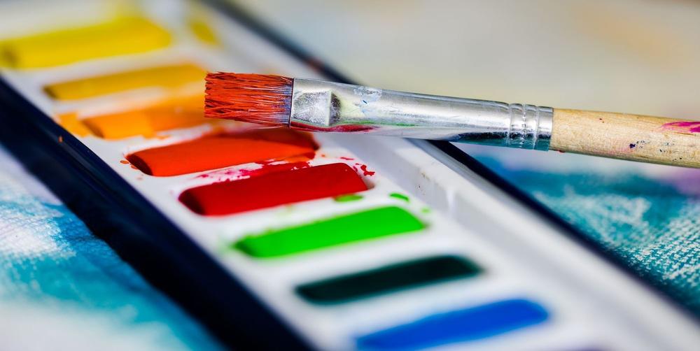
The font you choose for your logo can make or break the way customers feel about it. Some might stand out more than others, but that doesn’t mean they’re standing out for the right reasons.
![Why fonts matter ../assets/uploads/jeroen-den-otter-plpo8kr6q9e-unsplash.jpg)

If you’re designing your own logo, it’s worth turning to some of the famous fonts that professional designers love. They include:

Garamond for timeless elegance

Garamond is a set of fonts inspired by printing in Europe from the 16th to the 18th century. They’re found in logos such as Apple and American Eagle Outfitters. Choose Garamond if you want a stunning, timeless logo with broad appeal.

Futura for a modern-yet-friendly approach

If you want your logo to convey that your organization is modern yet friendly, try Futura. You’ll find this font in logos from companies such as Swissair and FedEx. It’s an excellent fit when you’re working in the travel industry or trying to achieve universal appeal across all ages.

Helvetica for a sense of familiarity

If you want potential customers to feel like they’ve known your company forever, despite never using your goods or services, try Helvetica. It’s popular among brands such as Hoover and Evian. With the sense of familiarity you create, you’ll also generate feelings of trust.

FF Blur for something a little different

Not everyone wants to conform when it comes to designing logos, and that’s okay. If you’d like to use something a little different, FF Blur is a worthy option. This font type is excellent for promoting events, new music, and bars.


Keep it simple

If you do choose to use images, make sure you don’t go overboard with colors or patterns. Logos are small creatures, which means trying to stuff too much into them will confuse your customers rather than charm them. In contrast, keeping things simple means they’re more likely to stand out in someone's mind.

Wherever possible, try to choose images that feature one color or two at the most. Make sure the designs aren’t too intricate. Complex logos may require your customers to see a large version in order to understand the message. If you’re going to scale your logo down so that it fits in an email or on a business card, every element needs to be instantly clear.

Finally, make sure the images you choose are relevant. Although flowers look pretty, they don’t exactly speak volumes when you’re trying to sell cutlery. If you’re struggling for inspiration, check out what some of the big names in your industry are doing. You shouldn’t copy them but you can gain an idea of what works.


Avoid trends

Like any other element of business promotion, logo design often comes with trends. For example, if you search for the term hipster logos, you’ll quickly see patterns among the designs. And while trends are excellent for gaining inspiration, they’re hardly going to make you stand out from the crowd. Following trends too closely increases the risk of customers confusing you with another business.

Another reason to avoid trends is that the big-name brands you know and love aren’t copying everyone else. Some of the world’s most famous logos include Nike, Vogue, and eBay. Their designers didn’t try to slot the brand into a template, so you shouldn’t either!


Use accessible software

If you take a DIY approach to designing your logo rather than using a professional, you can still generate something that’s stunning and doesn’t look amateur. A great tool to use is Canva, which allows you to create multiple marketing materials with set templates, or Looka, an AI-powered online logo maker and design platform. Although avoiding direct logo templates is the best idea, Canva has enough features for you to tweak the designs and make them your own. Most of the features are free but you can pay for clean-cut images and upload your own fonts for a seriously professional edge.

If you’re ready to take your skills up a notch or if you’re a fast learner, use Adobe Illustrator. YouTube is brimming with how-to videos that’ll help you learn how to use it, and it gives you an edge to create a logo that’s truly unique. Illustrator does come with a free trial period but you’ll need to pay to continue using the software if you need it beyond a month.


Experiment with your designs

During the logo design process, stop and ask yourself whether you’d feel impressed if you saw your design on a competitor’s website. If you’re struggling, show the design you’ve created to a discerningly honest audience to get their feedback. As this will be a permanent feature of your brand’s identity, you want to get it right.

Designing a high-quality logo is a careful process. Always start with a little research into what your brand’s identity should be like then move on to selecting colors and fonts. You can also look into color theories to find the best color that represents your brand. The steady moves you make now will save a lot of time in the future. When you’re able to look at your logo with pride, you’ll feel relieved that you took the process seriously.

Once you’re confident you have the right colors, images, and fonts, get to work and keep experimenting. With time, you’ll create a logo that really sings to your brand and appeals to your customers.

Draft your site in 60 seconds

Get an AI website made specifically for you that's free to launch.

Start for free ✨

No credit card required

Related posts

5 ways AI can enhance your website

Spend less time on your website and more time growing your business

Let B12 set up your professional online presence with everything you need to attract, win, and serve clients.

Get started for free

Product

Industries

Customers

Helpful information and tools

Company

© 2024 B12. All rights reserved.
PrivacyTerms of Service