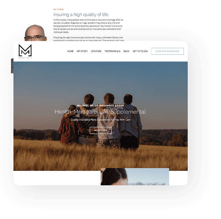
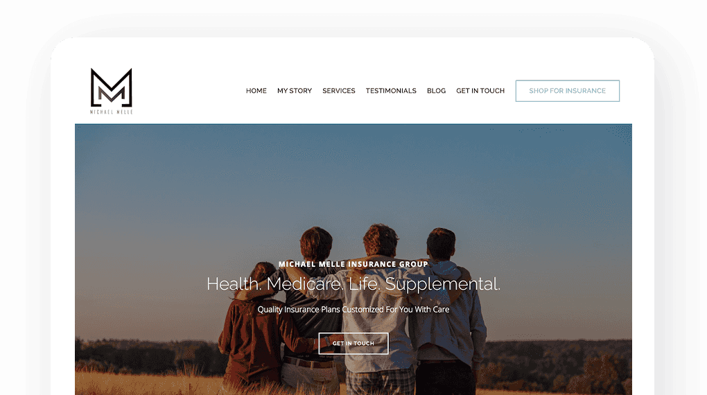
A website can fuel growth for your health insurance agency
Everyone shopping for health insurance has questions.
Deductibles, co-pays, and premiums are all terms that overwhelm consumers, who are looking for an expert to help guide them through confusing concepts and insurance jargon. As an experienced insurance agent, you have answers, but is your health insurance agency website effective in conveying the breadth of your expertise?
As people search online for the best health insurance coverage options, ensure your site communicates your value, allows you to easily connect with leads, and effortlessly fosters your client relationships. Positioning your health insurance brokerage as trustworthy and knowledgeable, and making it easy to work with you will increase your chances of successfully scaling.
Create your free website in seconds

Reach health insurance shoppers online and sell more policies
Health insurance is sometimes seen as an investment, but usually as a burden.
Make the health insurance shopping experience more pleasant for prospects by addressing health insurance FAQs succinctly in your website content, making it easy to book a consultation with you, and reducing the steps to pay their bill online.
Embracing automation in more of your website workflows, like reminding clients about an upcoming appointment or unpaid invoice, leaves you more time to offer personalized service and maintain client relationships, showcasing the human side of your business.

Fundamentals of great health insurance web design

Design your site strategically
When designing a new website for your health insurance agency, plot out how you want to present your services and choose a layout, images, and content that supports your business goals. Design elements like color scheme, navigation, call to action buttons subtly persuade visitors to stay on your site and learn more about your expertise.
Establish your firm as an authority
One way to establish authority as a quality health insurance provider is to create helpful, relevant content that interests your target audience. This helps you build credibility with potential customers and increases your visibility online by improving your search ranking when you include competitive yet winnable SEO keywords in your website content.
Convert traffic into leads
Removing friction and hesitance from your website experience makes visitors more likely to become leads, and ultimately clients. Some website elements that can increase conversion include adding positive client reviews, short lead forms, live chat, and strong CTAs (calls to action).
Make it easy to work with you
If it’s not easy to contact you or buy health insurance products on your website, visitors will write you off in seconds and go to one of your competitors. A user-friendly website that lets people schedule consultations, pay online, and submit important documents increases your chances of converting and retaining clients.
Professional insurance website design can grow your business

What do other service providers think of B12’s approach to web design?

I would recommend B12 to any company that wants a team to manage and grow their website while they focus on growing the business. With B12, founders can be rest assured that their website is in good hands and, more importantly, prove its value and ROI.
Leroy Maxwell Jr.
Founder of Maxwell Tillman / B12 customer Since 2020

What B12 offers in terms of support service and design knowledge is what we were looking for. We finally have a website we’re proud of.
Brett Packard
Head of Operations at TaxStudio / B12 customer Since 2021

We save a lot in monthly costs by switching to B12. We aren’t charged extra for optimization tools anymore. We aren’t overcharged for redesigning, because with B12, making changes are part of your normal day.
Barbara Bartelsmeyer
Partner & COO of Action Logistix / B12 customer Since 2020
Helping health insurance providers across America look professional online
B12 has built thousands of websites for professional service firms, including many for health insurance providers. We know how to produce a beautiful, on-brand website that communicates your expertise, generates leads, and simplifies the process of working with clients online.
The B12 platform is great for small and growing insurance agencies, because our team of designers, copywriters, and SEO specialists manage your website project and help you launch within 30 days, so you’re able to focus on providing your audience with the best health insurance policies and processes. Take control of your online presence whenever you’d like, using our user-friendly DIY website editor.
The B12 platform was built to grow service businesses, not just launch a stagnant website. Your site includes every tool you need to develop your brand and sell services online, including online scheduling, payments and invoicing, contracts and eSignatures, and client intake forms.
Frequently asked questions from
health insurance firms
Create website content for each insurance category and service you offer. For example, if your agency provides car insurance, business insurance, and life insurance, make sure you have a dedicated service page and blog posts for each. This increases the likelihood that people searching for these insurance types will find your business, engage with your content, and contact you to learn more about insurance policies.
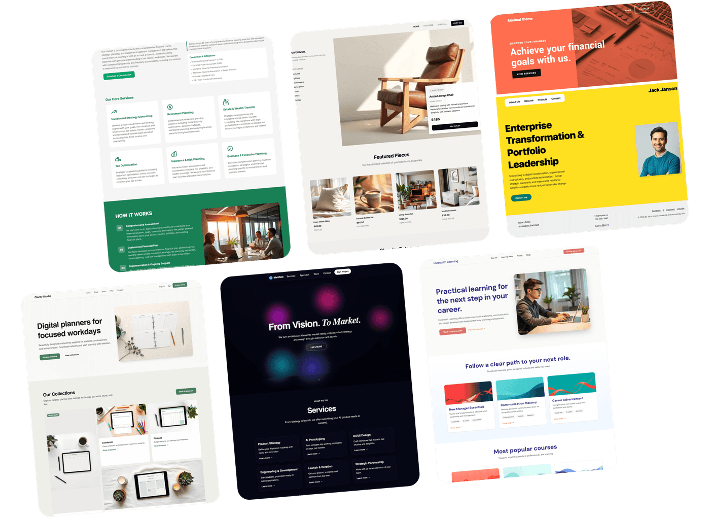
There are plenty of great health insurance websites you can reference for inspiration, and the B12 website gallery is a great place to start.
The best place to put testimonials on your website is any high-traffic page or page where you’re trying to increase clicks and conversions. Some examples are your insurance firm’s homepage, About page, Services page, or Contact page. Many firms find it beneficial to have a dedicated Testimonials or Reviews page, as well as sprinkle featured reviews across their site.
Choose testimonials that address a range of the value and benefits your insurance business offers, from affordable prices and great customer support to make the process of filing a claim fast and painless.
A lead magnet is a marketing technique that attracts leads by offering a resource in exchange for the person’s contact information. Lead magnets usually take the form of an ebook, template, or another downloadable resource.
For a health insurance company, an example of a lead magnet landing page is one where you advertise a free ebook on how to understand the features of a health insurance policy and choose the right one. Once visitors click a “download now” CTA button, your site presents a landing page where they fill out their name, email address, and any other relevant information. Then, they’ll receive your ebook in their inbox, and your firm will have gained a new lead.
The most effective CTA depends on the action you're encouraging. Whether you’re trying to nudge visitors to sign up for a discount offer, receive your agency's emails, or read about a new service you offer, make sure your CTA is clear. Best practices for all website calls to action are to keep them short and to the point. Use words that inspire action and resonate with your audience.


